OneNote on OSX, first impressions
Posted in OneNote on August 25, 2014
Recently I moved to Apple's OSX as my primary operating system. It has gone very smoothly with me taking a Macbook Air on holiday (with no work or email loaded onto it!) so I could get used to it and when back I had a few transition days where I did productive work with both old & new machine side by side.
One thing I was extremely nervous about was what the brand new OSX OneNote would be like, just how limited would its feature set be compared to the amazing Windows desktop version?
In turns out that the OSX team have got it just about right for a first (well, second as there was a small update recently) release and the version is useable, even for a hardcore OneNoter like me. Below I'll quickly list out some points and highlight some hopeful areas for urgent improvement.
The Good
Starting with the good stuff, it's mostly there. Woo Hoo!
You can open multiple notebooks including - now with the minor 2nd release - password protected sections. You can have multiple OneDrive profiles & you can embed files. As far as I can tell all the basic things that one would do with OneNote have been directly replicated. It's all good.
It gets better. For avid users the OSX team have copied over the keyboard shortcuts pretty comprehensively so that most things which would be Ctrl+(something) are now Cmd+(same something), interestingly some of these are not even documented I just happen to know them from years of use on the Windows version.
Annoyances
There are a number of things that are annoying but I assume will come in time.
No custom tags. A few months ago this would have been a show stopper for me but one of the reasons for moving to OSX was so I could use the amazing OmniFocus. Therefore my GTD system based on custom tagging is no longer needed.
No ability to specify a default section or page for new items like my Inbox section on Windows, though this is kind of moot as you'll see below.
When doing Cmd+N for a new note the focus is given to the note body, not the title which is annoying if you're creating a bunch of notes.
Linking to pages, seems to only link to the web version.
No ability to have more than OneNote window open.
No dock to desktop feature.
Needs to improve urgently (please!)
UI and navigation
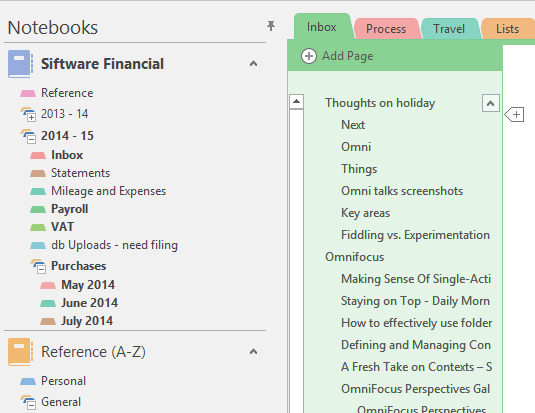
It's hard to find & neatly organise things with OSX OneNote. Take this screenshot from my Windows machine.

Starting from the top right, in OSX you cannot:
-
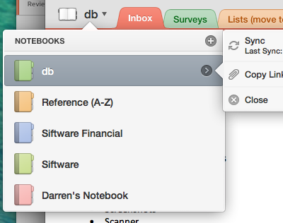
Pin the notebook & section list, you just get a list of notebooks and see section tabs only when in that section. You either need to use the search or know where sections are. This gets ungainly very quickly
-
See the bold section names? This indicates that my accountant has been editing some of the pages, you don't get that feedback in OSX
-
See the little arrow next to 'Thoughts on holiday' this allows you to collapse pages in a section. This feature doesn't exist in OSX
-
You also can't drag pages to define a hierarchy (though there is a keyboard shortcut)
-
There's also no little plus symbol for creating a new page in-situ
-
Finally see how I have my page list on the left, next to section list (did I mention that you can't pin the section list in OSX). Well you've guessed it, there's no option to move the page list over to the left like there is on Windows
For me this list is the biggest issue, it makes my notebook list ungainly and hard to navigate. Can we have these UI features in OSX urgently please?
For context, here's the similar list in OSX, note no section list and definitely no option for pinning.

Operating system integration
There is none.
No screen clipper, no quick notes, no 'paste to OneNote' (a wonderful feature I found when using Evernote) I also am unable to use my ix500 scanner because, I assume, there's currently no way for external apps to write directly to OneNote (I guess they could use the REST API, but that still needs more work too)
I've had to install Evernote and use its (excellent) integration features to not slow my workflow down and I then manually copy & paste clippings etc over later. For me this is no big deal but I'm already sold on OneNote and have invested a lot of time getting my system working for me. My concern here is that for Evernote users they'll take one look at OneNote and it will appear to be lacking so they'll ignore it.
Summary
It's a very impressive first attempt and hats off to the dev team for getting so much nailed in v1. That said once you scratch the surface either as an experienced OneNote user migrating from Windows or as an interested Evernote user considering the switch, then it is found to be limited quite quickly. Particularly in the UI/navigation department.